
Multi-time frame analysis is a technical analysis technique that uses multiple time frame charts for chart analysis.
It is also called “environmental awareness” because it provides an accurate understanding of the market conditions under which the current exchange rate is being traded.
Multi-time frame analysis is so popular that it has been called an essential skill in forex trading.
By incorporating multi-time frame analysis into your forex trading, you can increase the accuracy of your trades and improve your profit/loss results.
In reality, however, it is difficult to use it well, and many forex traders use it with only a vague understanding of how to do so.
In this article, we will provide a detailed explanation of multi-timeframe analysis, from the basic method to specific trading techniques and various tips.
- Basic knowledge of multi-timeframe analysis (environmental awareness)
- Explanation of the “Horizontal Line Trading Technique” using multi-timeframe analysis
- Rules of the Horizontal Line Trading Method (Setup)
- How to do multi-timeframe analysis of upper timeframe charts (4-hour timeframe)
- How to do a multi-timeframe analysis of a medium-term timeframe chart (30 minutes chart)
- How to do a multi-timeframe analysis of a short timeframe chart (5 minutes chart)
- Comprehensive chart analysis to determine superiority
- Entry Methods (Triggers) in the Horizontal Line Trading Method
- Trigger rules by price action
- How to use multi-timeframe analysis as an “early price movement detector
- Important Note on Multi-Timeframe Analysis
- How to synchronize lines drawn on MT4 with each time leg
- How to do a multi-timeframe analysis (environmental awareness) – summary
Basic knowledge of multi-timeframe analysis (environmental awareness)
Multi-time frame analysis uses multiple currency charts, from large time frame charts to small time frame charts, and integrates the results of analysis on each chart to make entry and settlement decisions.
This may sound esoteric when you hear it this way.
In reality, however, the same technical analysis is basically repeated for each time frame chart, so once you get used to it, you will realize that it is actually a simple analysis method.
Let’s first understand the basics of multi-time frame analysis.
Basic Flow of Multi-Timeframe Analysis
- First, the market environment is recognized on the large time leg (upper leg) to determine whether the market is in an uptrend, downtrend, or sideways (range market), and chart points are identified.
- Next, look for entry points on smaller time frames (lower time frames). The basic rule is to trade in the same direction as the upper leg.
- The time leg to be used depends on the trading style. For scalping, use the 1-hour, 5-minute, and 1-minute timeframes; for day trading, use the daily, 4-hour (1-hour), and 30-minute (15-minute) timeframes.
Let’s take a closer look at these items.
How to do a basic multi-timeframe analysis (environmental awareness)
In general, multi-time frame analysis uses three types of charts: “long-term time frame chart,” “medium-term time frame chart,” and “short-term time frame chart”.
*The combination of each time frame will be explained later.
How to analyze a long-term hourly chart
The first step in the analysis is to identify the existence of a trend and major highs and lows on a long-term chart, draw support and resistance lines, and identify the trend direction and range.
The key to analyzing a long-term chart in multi-time frame analysis is to look at the relationship between the current price and the lines that may cause an attack or defense, while keeping an eye on the overall market situation.
The larger the time axis of the chart, the larger the amplitude of the price wave, and with daily time frames, a single wave can last for a long period of time.
This can lead to price movements in the opposite direction of the trend (adjustment price movements) lasting for days on end.
When you first start working with multi-time frame analysis, it is easy to become fixated on the direction of the trend.
In actual trading, however, remember that what you should be looking at on the long-term time frame is the rate (line) at which the selling and buying are likely to take place.
How to analyze the medium-term time chart
Moving on to the medium-term time frame chart, we will perform the same trend and range analysis by identifying the major highs and lows and drawing support lines.
The analysis of the intermediate-term chart in the multi-time frame analysis focuses on the relationship between the current rate and each of the factors identified in the long-term chart (highs and lows, lines, etc.).
For example, if the current exchange rate is located directly below the resistance line of the long-term time frame, we treat that fact as important analytical information.
In other words, we check “where the current rate is located on the long-term time chart.
How to Analyze Short-Term Time Frame Charts
The next step in the multi-time frame analysis is to analyze the short-term time frame chart.
Here, as in the analysis of the medium-term time frame chart, we analyze the current price in relation to the highs and lows on the medium-term and long-term time frame charts.
For example, “The price has repeatedly rebounded above the support line on the medium-term time chart and has been moving sideways on the short-term time chart.
Another common example is a case where the lines of the long-term leg and the medium-term leg almost overlap.
When lines overlap like this, it means that the highs and lows are being watched by more traders, so do not take the easy way out by trading toward those lines.
Synthesize the analysis of each time frame chart
At the end of the multi-time frame analysis, we will integrate the analysis results of each time frame chart to make an overall trade decision.
However, there is no need to think about anything complicated at first.
Multi-time frame analysis is the same as using “multiple maps of different scales” to understand the current situation.
For example, think of the long-term time chart as a “world map,” the medium-term time chart as a “national map,” and the short-term time chart as an “urban map.
To understand this trick, let me give you an analogy.
A parable that illustrates the importance and tips of multi-timeframe analysis
Suppose you suddenly find yourself in a warp somewhere in the world.
You are thrown into a strange land and must somehow make it back to your city.
You have several maps of different scales and a GPS (Geo-Sensing Device) at hand.
First, you check the world map and find that you are currently in Egypt in northern Africa, with a desert spreading to the west.
Next, looking at a map of Egypt, we learn that “we are currently in a city called Aswan, and the Nile River flows nearby.
Finally, looking at a map of the city of Aswan, we learn that “we are currently on the eastern outskirts of the city, the train station is here, and the hotel is over there.
By using maps of different scales in this way, we get a better overall picture of where we are.
If we had neglected to check the larger map and only looked at the smaller map as we moved around, we might have gotten lost in the desert and been in a lot of trouble.
If we had not known that we were now in northern Africa, we might have been struck by the drastic difference in temperature between day and night, and our bodies might have been destroyed.
And even if I had managed to reach the station in Aswan, I would not have known where to go from there.
On the other hand, looking only at a world map, one would have no idea where to go on the streets of this city.
Thus, by using multiple scales of maps to investigate, we can comprehensively (from a bird’s eye view) understand what kind of place we are currently in and where we are headed.
Benefits gained from multi-timeframe analysis
Think of forex multi-timeframe analysis as the same thing as the map in the above analogy.
- If you can look at a large time frame chart and know in advance that “there is a support line that has been identified many times just below the current rate,” you can avoid the trouble of wandering into a desert area without knowing it.
- If you observe that an uptrend is developing on the medium-term time chart, you will be able to take a buy position as if you were moving on a railroad.
- If a sudden range break occurs on the short-term time chart, but you know that there is a big river flowing just ahead of it and it is not easy to cross, you can take a wait-and-see approach and consider a “dummy break scenario.
By using multi-time frame analysis to get a bird’s eye view of the entire chart, it becomes clear what trades are advantageous to make at the moment.
As a result, you can expect to increase the accuracy of your trades, reduce unnecessary loss trades, and stabilize & improve your profit/loss.
If you have used Google Maps, you will know that by turning the mouse wheel to zoom in and out, you can get a three-dimensional view of the location you want to examine and its surroundings.
With experience, you will be able to do the same thing with multi-timeframe analysis, in which you can switch between multiple timeframe charts at will.
Beware of the “illusion of price range” in multi-timeframe analysis
Incidentally, maps and charts share a common illusion.
It is “the illusion of distance due to the difference in scale.
Even if the size of a map of Japan and a city map are the same, the distance per unit of distance differs greatly due to the different scale of the maps.
A place that seems close on a Japanese map may be too far away to fit on a single map when you check it on an urban area map.
Similarly, a high price just a few candles away on a daily chart may be far away on a 15-minute chart.
This “illusion of price range” can cause excessive hesitation in trading scenarios toward the upper hourly support and resistance lines, even though there is actually enough range to reach those lines.
This illusion is often seen when one becomes accustomed to multi-time frame analysis, so it is important to check the price range on the chart when one becomes accustomed to it.
Combination of charts used in multi-timeframe analysis
There are no set rules or patterns for chart combinations used in multi-timeframe analysis.
Various combinations are used depending on the trading methods of each Forex trader and the results of their verifications.
However, there are some general trends and reasonable combination patterns, which are explained below.
Patterns combining 6 to 8x ratios
A popular style of multi-time frame analysis charting is to align the ratio of time legs for the long, medium, and short term charts at 6 to 8 times the ratio of each chart.
For example, if the short-term time leg used for entry and settlement is the “30-minute leg,” the combination would be as follows
- Long-term time leg chart: daily
- Medium-term time chart: 4-hour time chart
- Short-term time leg chart: 30-minute leg
You can see that the ratio of each time leg is 6x or 8x.
For day trading where the price range to aim for is short, there is a style where the long-term time leg chart is 4 hours and the short-term time leg chart is 5 minutes (the ratio of the 5-minute and 30-minute time legs is 6 times).
Patterns combined in a ratio of around 4x
Another popular style is the multi-timeframe analysis method, aligning the ratios around 4x.
- Long-term time frame chart: 4-hour time frame
- Medium-term time frame chart: 1 hour
- Short-term time frame chart: 15-hour time frame
As you can see, in the above combination, the ratio of time frames is aligned at 4x.
The combination of the daily leg as the long-term hourly chart and the 4-hour leg as the medium-term hourly chart (6x here) is also widely favored by swing traders and day traders.
Another pattern used by swing traders is to select the weekly leg as the long-term time leg chart and combine the daily and 4-hour legs (5x ratio between the weekly and daily legs).
For day traders with shorter price ranges, the 1-hour chart is often used as the long-term chart and the 15-minute and 5-minute charts are often combined (3-4x ratio).
For scalpers, a combination of the 15-minute and 5-minute legs, plus the 1-minute leg, is possible.
Pattern of combining time frames that are considered to be of high interest
There is another method of multi-timeframe analysis that combines timeframe charts that are generally considered to be of high interest, without being too particular about the ratio.
In this case, in many cases, the user is free to choose among weekly, daily, hourly, 15-minute, and 5-minute time frames.
In particular, the daily and hourly timeframe charts are considered to be the most popular timeframe charts in the world.
What is the recommended time frame combination pattern?
Based on my past verification and trading experience, I would say that a combination of time frames with a ratio of less than 4x may make multi-time frame analysis more difficult.
The reason for this is that it tends to be difficult to differentiate between charts in recognizing patterns on the chart – in other words, “the rates of characteristic highs and lows are similar.
Therefore, for beginners in multi-time frame analysis, I recommend a combination of 6 to 8x ratios.
Incidentally, in my initial chart verification, I also conducted multi-time frame analysis in the 6-8x ratio style, using the 4-hour time frame as the long-term time frame chart.
After further verification and practice, I developed a style in which I selected from six time frames including the daily time frame as appropriate, but you should avoid using many time frames from the beginning.
Until then, I recommend that you practice and verify with three charts (four at most).
Explanation of the “Horizontal Line Trading Technique” using multi-timeframe analysis
We will now explain the “horizon trading method” using multi-timeframe analysis.
By following the specific analysis and trading flow, you will be able to understand the multi-time frame analysis naturally.
The trading style assumed here is “day trading with entry and exit on a 5-minute time frame.
The currency charts used for multi-time frame analysis are the 4-hour, 30-minute, and 5-minute time frames.
For simplicity and clarity, we will use only horizontal lines (support and resistance lines) for technical analysis.
There are no indicators such as MACD, Stochastics, or even moving averages on the chart.
The reason for this is that we believe that “analysis by horizontal lines” is the quickest way to understand and practice multi-timeframe analysis and to understand its essence.
Reference How to draw horizontal lines on a forex chart and what they mean?
Rules of the Horizontal Line Trading Method (Setup)
This trading method utilizes the advantage of price movement at support and resistance lines, and is characterized by the ability to hold a position with relatively low risk (a situation where the probability of the rate moving in the opposite direction of the entry is low).
Simply put, it is a basic and royal style rule to “buy on the way down” or “sell on the way back” in the direction of the trend (continuation direction) of a large time leg.
Basic rules (setup rules)
- A multi-timeframe analysis is performed to check if the following conditions are met.
- The long-term time frame is in a trend or in a range with a stalled trend.
- The intermediate-term leg is either trending in the direction of the long-term trend (or in the direction of the continuation of the trend if the long-term leg is in a range) or exiting the line in the direction of the trend.
- The Short-term leg is supported by the Long-term or Intermediate-term line along the trend direction of the Long-term leg (or the continuation direction of the trend if the Long-term leg is in a range), or exiting the line in the direction of the trend.
- In the case of a breakout from the line, a roll reversal of the line should be confirmed on the short-term time leg.
- If there is a long-term or medium-term line near the direction in which you intend to trade, wait and see if the price moves through the line again, or wait for the rate to come back to the line that you can back up to.
The trading rules listed here are called “setups” and are used to narrow down the market conditions that have an advantage.
Once we have confirmed that the conditions of these setup rules have been met through multi-timeframe analysis, we will now use the entry rules, which we call “triggers,” to make the actual entry.
How to do multi-timeframe analysis of upper timeframe charts (4-hour timeframe)
Now, let’s actually proceed with the multi-time frame analysis according to the setup rules.
In the analysis of the upper time frame chart, we will first follow the rate trend from the left side (past) and draw horizontal lines at the following highs and lows in the range close to the current rate.
- Highs and lows that have reversed several times (including roll reversals)
- Pushes and reversals.
- Recent highs and lows.
- Necklines of double bottoms and double tops.
The image is that the current price position is in a wave, and lines are drawn at the upper and lower limits of the wave.
The above points are looked at in the same way on other time charts, and lines are drawn as necessary.
Now let’s look at the actual chart.
The chart below is the 4-hour time frame of the dollar-yen, which is the upper time frame chart.
Please assume that the place where the thick gray line crosses is the “current exchange rate” and continue reading the following explanations.
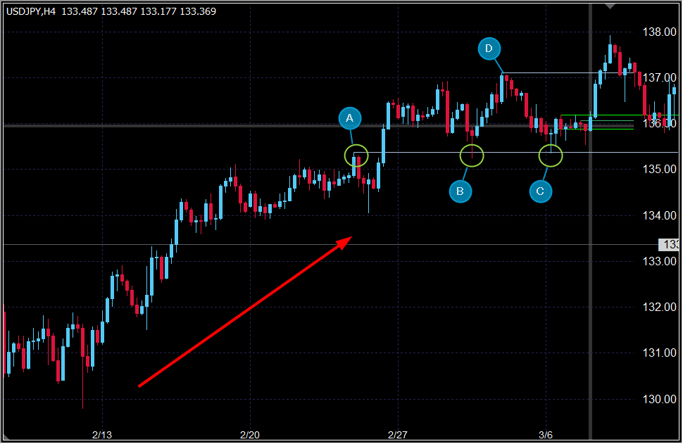
The trend was forming an uptrend, with the highs and lows rising, but now we can see that the trend has stalled and the market is in a range.
Since the trend has stalled and become a range in the Setup Rules, we will analyze the market based on the assumption of “buy entry” in the direction of continuation of the trend.
Now, the price has broken above the high “A” and then roll-reversed to a support line (the price has stopped at the lows “B” and “C”).
This roll reversal line is close to the current rate position and is expected to influence the multi-time frame analysis, so it should be marked well.
In conjunction with this, we will also mark a line at the high “D” which may be the upper limit of the range.
Looking at the current rate position, we can see that the price continues to stagnate near the lower end of the range (about 10 candles are lying side by side in the same price range).
Above the current rate, we are in a price range up to the high “D” resistance line, and we cannot see any line of resistance up to that line (there is room for price movement up to the upper end of the range).
If we look at the candlesticks in detail, we can find many other points of interest, but for this basic lesson, we will skip them and proceed with the multi-time frame analysis, focusing simply on the high and low prices.
How to do a multi-timeframe analysis of a medium-term timeframe chart (30 minutes chart)
Let’s then analyze the 30-minute dollar/yen chart, which is a medium-term time frame chart.
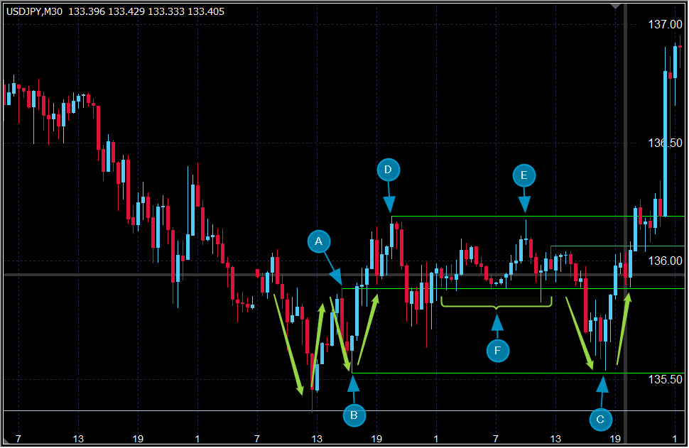
Similar to the analysis of the upper time frame 4-hour chart, lines are drawn at the highs and lows of interest.
At a quick glance, the visible price movements are very different from those of the 4-hour chart, which may be confusing to those who are not familiar with multi-timeframe analysis.
But remember the “map analogy” from earlier.
Think of this 30-minute chart as an enlarged (close-up/zoomed-in) version of the last two days’ price movements on the 4-hour chart.
For example, the price movement of the short-term downtrend in the left half of the 30-minute chart corresponds to the price movement of about 10 candles from high “D” to low “C” on the 4-hour chart shown earlier, enlarged and detailed.
The lows and highs that make up the double bottom are in awareness.
Now, a closer look at the 30-minute chart shows that a small double bottom has formed with high “A” as the neckline, and although it once broke below the neckline, it rose again, and there are signs of a range while the neckline is still being recognized (it stopped at “F”).
Therefore, a line should be drawn at the high “A” and the high “D” should be drawn at “E” as well.
If the price were to rise from the current rate, it is assumed that there is a possibility that a trading battle will occur at the high “D” line.
Since the low price “B” of the right bottom of the double bottom is clearly identified at the low price “C”, we should also draw a line at this low price “B”.
Analyze the circumstances leading to the current rate
Let’s analyze how the current rate is performing.
In the recent past, the price once broke below the neckline with great momentum, but it soon returned to within the original range (above the neckline) with the same momentum, indicating that the buying momentum is strong.
Therefore, the neckline may continue to serve as support for some time to come.
And it is important to note that this 30-minute situation is “occurring against the backdrop of the 4-hour support line.
In other words, the strong rebound rise at low “C” could be seen as a result of the support line on the upper time axis chart functioning.
If this is the case, then it is risky to take an easy sell entry, and selling is not a superior choice.
This corresponds to the “situation where the price is against the line along the long-term time chart trend direction” in the setup rules.
How to do a multi-timeframe analysis of a short timeframe chart (5 minutes chart)
Next, let’s analyze the 5-minute dollar-yen chart on the short-term time frame chart.
Here again, the method of multi-time frame analysis is basically the same as in the previous hourly charts.
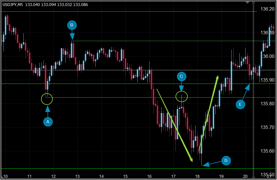
We can see that the low “A” is conscious at the high “C” by the roll reversal, so we will draw a line here.
A line is also drawn at “B,” which is the high price at a place where the range state has continued to some extent.
Incidentally, the high “B” is also a noteworthy high price called the “return high” in the past.
Since a range was formed for a while after the high price “B” was set, there is a possibility that the high price “B” will remain in consciousness in the future.
In fact, in the price movement just before the current price, there was a small reversal with many upward whiskers when the current price was close to the high “B,” which indicates that the high “B” is being considered.
Analyze the circumstances leading to the current rate
The price rebounded up vigorously with a low “D” on the 30-minute line and once back to the high “B” area.
This falls under the setup rule of “a situation where the price is supported by a “long-term or medium-term horizontal line” that follows the trend direction of the long-term time leg.
The price has stopped lower against the neckline “E” of the 30-minute double bottom, which is the current price situation.
If the rate continues to stay without lowering after this, then this also falls under the same setup rule as before.
Comprehensive chart analysis to determine superiority
So far, we have used multi-time frame analysis to check whether the setup conditions are met on each time frame chart.
Below is a summary of the analysis results revealed by the multi-time frame analysis.
I believe that by reading the results of this analysis, you will gain a better understanding of this horizon trading method.
- The major trend is moving from an uptrend to a range at the 4-hour level, with the previous high line functioning as a support line with a roll reversal (basically a market situation where the possibility of an uptrend continuation remains).
- A double bottom has formed on that support line on the 30-minute time frame, and a strong rebound rise is also occurring at that high-low line as the high and low of the bottom become aware.
- Since there are several lines where a strong rebound is expected when the rate moves down from the current rate position, the probability of a decline in a short period of time is considered low unless future price movements that recognize the strength of the selling forces appear.
- There is a resistance line in the price zone above the current rate where a sell-off and a buy-off may occur; however, there is no evidence (past price movement) above the line that suggests a strong reversal decline is possible.
- Based on these circumstances, we can conclude that this is a “market situation where buying has the advantage over selling.
In this example, we have summarized the rules for determining superiority as the foundation of the trading method as “setups.
For a detailed explanation of the position of setups in a trading method, please refer to the following article.
Explanation What is a setup? How to create the key components of a FX methodology
Entry Methods (Triggers) in the Horizontal Line Trading Method
Now, once the conditions of the setup rule have been satisfied and the advantage suitable for buying or selling in the trend direction (trend resumption direction) of the upper time chart has been confirmed, the next step is to watch the price movement on the 5-minute chart and enter and close according to the “trigger” rule, which is an entry-only rule.
The basic premise is that the trigger rule does not need to be complicated under the condition that the setup rule has secured a certain level of advantage.
In fact, simpler trigger rules tend to be more responsive to price fluctuations and reduce the possibility of misinterpretation of decisions.
Again, whether or not the entry method described here will work is based on the premise that the presence or absence of an advantage should be determined by setup rules based on multi-time frame analysis (trigger rules alone do not provide a notable advantage).
In this case, the setup rule has determined that there is an advantage in the buy entry against the support line of the multi-time frame, so the following entry method will work.
Trigger rules by price action
Entry can be made in one of the following two ways
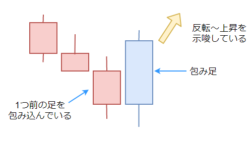
- Entry at the high breakout (low breakout for selling) of the “wrap-around” candlestick.
- Enter at the timing of a rising low (or falling high in the case of selling).
The “1” trigger rule is based on a single candlestick. A “wrapping leg” is a candlestick that exceeds (wraps around) the high and low of the previous candle.
Entry is made when the wrapping candlestick is confirmed and the high (or low in the case of selling) is exceeded.
The “2” trigger rule is to enter the market at the timing of a breakout of the low price – in other words, at the timing of a breakout of the recent high price (or vice versa in the case of selling).
In this example, a “white candlestick” appeared three bars after the current rate on the 5-minute chart, so the timing of a break above the high of this wrapping leg corresponds to trigger rule “1”.
About the stop-loss point
The most important factor when making an entry is the stop loss.
A clear stop-loss point must be set in advance, and it is essential to establish trading rules for this purpose.
In this case, we will prioritize simplicity and choose the line closest to the current rate among the following three lines, and close at a stop-loss when the line breaks out.
- The horizontal line on the short-term time chart below (above in the case of selling) the current rate.
- The “push-low” line (or “return-high” line in the case of selling).
- A horizontal line on the medium-term or long-term time chart.
In this example, there is a neckline on the 30-minute chart just below the current rate, so a break below this horizontal line is the stop-loss point.
About the profit point
Profit taking shall be closed when the target rate is reached.
The target rate is the “mid-term or long-term line” above the current rate (or below the current rate in the case of selling).
In this example, the target is the line drawn at the high “D” on the 30-minute chart.
Forbearance rules based on risk-reward ratio
Once the stop-loss and take-profit lines are determined, the risk-reward ratio is calculated.
Calculation does not require any difficult calculations; it is simply a matter of checking whether the price range from the current rate to the stop-loss line is larger than the price range to the target line.
If the stop loss is greater, then the entry should be abandoned and we should wait and see if the rate moves closer to the line we are going to turn our back on, or wait for new setup conditions to become available.
In this example, the price range to the target line is clearly larger, so we will take the position as soon as the entry timing arrives.
These are simple horizontal line trading techniques using basic multi-time frame analysis.
Please do not try this out of the blue in a real market.
Always practice multi-time frame analysis repeatedly using past charts and trade on demo or practice software at first.
How to use multi-timeframe analysis as an “early price movement detector
With multi-time frame analysis, you can observe and analyze the entire market situation from a bird’s eye view, and thus accurately determine whether the current situation is one in which selling or buying has the advantage.
This is a major merit of multi-time frame analysis, but there is another useful usage.
That is how to use multi-time frame analysis as an “early price movement detector.
For more details, see the article below.
Explanation How to use multi-timeframe analysis to discover advantages early
Important Note on Multi-Timeframe Analysis

Up to this point, we have explained the specifics of how to perform a multi-timeframe analysis.
Now, in practicing multi-timeframe analysis, you need to be aware of the following “important points to keep in mind.
Some of these caveats include the fact that what is generally considered to be the “correct use of multi-timeframe analysis” is actually not the case, so I hope you will read them carefully.
Avoid getting too caught up in the direction of the trend on the upper time axis chart
This is often the case for forex beginners who are just beginning to work with multi-time frame analysis. Just because the upper time frame is in an uptrend does not mean that you should not make a sell entry in the time frame in which you execute your entry.
Similarly, just because the upper time leg is in an uptrend does not mean that you should make a buy entry anywhere and everywhere.
If a beginner forex trader thinks that “buy entry has the advantage now,” he/she will inevitably see every price movement in front of him/her as a buying opportunity.
However, the market conditions on the upper time axis chart only show the “state of a large wave flow,” and within that flow, strong waves in the opposite direction may occur, and waves in the opposite direction may continue for an extended period of time.
If you forcefully repeat a buy entry under such circumstances, you will quickly end up with a mountain of losses.
Price movements on the upper time frame chart tend to eventually return to a major trend, with important chart points becoming the battleground for buying and selling.
Therefore, on the upper time frame chart in the multi-time frame analysis, it is important to pay attention to “chart points that can be points of contention”-that is, important highs and lows, including the horizontal line, after understanding the direction of price movement (trend direction or the direction that led to the range).
Compare the trend direction on the upper time axis chart to a typhoon
Let me give you an analogy.
When a typhoon approaches, the “southeast wind” blows strongly.
Think of the direction of this strong wind as the trend direction on the upper time axis chart.
However, in mountainous areas, the direction of the wind changes depending on the location, and in towns, the wind may weaken in places where it hits buildings or structures, or turbulence may occur.
These geographical conditions of the region correspond to the “conditions on the medium-term time chart.
And the “momentum and direction of the wind” that you feel from where you are standing is the “price movement on the short-term time axis chart.
Relationship between the direction of the typhoon trend and the wind direction at the spot
Walking along a street lined with buildings during a typhoon, you will sometimes encounter fierce southeasterly winds, and at other times the wind will suddenly weaken for a moment, or blow in from a completely different direction than it had before.
Walking through the forest during a typhoon, you may come across a place where the wind is not blowing from anywhere.
Then, when you emerge into an open area with good visibility, the strong winds will again be blowing in from the southeast.
In all of these situations, the “typhoon wind direction = trend direction” is still the “southeast wind.
However, the presence of “characteristic terrain or buildings” that weaken, change direction, or cause turbulence will change the direction and momentum of the “southeast winds” in the medium to short term.
Chart points that influence the trend are important
In other words, “typhoon wind direction = trend direction” is important, of course, but equally important is “the existence of something that influences the wind direction.
The same applies to FX multi-time frame analysis. It is important to identify chart points where the direction of the typhoon winds may change, and to understand their position in relation to the current rate, rather than just being caught up in the direction of the typhoon winds.
Once this becomes clear, you will be able to see situations where you should avoid entry even if you are following the direction of a major trend, and conversely, you will be able to take advantage of strong short-term price movements that are against the upper leg trend.
No need to wait for the trend direction to align on all time legs
The next important point to note is a misconception about the use of multi-time frame analysis.
In multi-time frame analysis, the best opportunity is when all time frames are trending in the same direction.
Many forex traders may have seen this statement before.
While this is true in one respect, following this statement to the letter can result in a lot of losing trades.
The reason for this is that in multi-time frame analysis, a market situation in which the trend direction on all time frames from long to short term is aligned tends to be what is called a “fully extended scene” in the medium to long term time frames.
As a result, there are many cases where the market is caught in an adjustment reversal after entry on the short-term time frame chart, and it is easy for the trend to resume after a loss is taken.
Multi-timeframe analysis is more than just addition
It is precisely in such “fully extended situations” that one should, as in the typhoon analogy, ask, “Is there any point ahead where the winds will change direction?” and analyze the upper and mid-term time frame charts to grasp the chart points and wait for a favorable situation with an advantage to appear.
Multi-time frame analysis is not mere addition.
It is not OK if each time frame chart shows the same signs all the time.
The key to multi-time frame analysis is to zoom in and trace the route (buying and selling) that led the market to its current price position.
Don’t be fooled by the phrase, “The best opportunity is when all time frames are in trend and their directions are aligned,” but be able to analyze price movements on each time frame comprehensively.
Don’t get too attached to the upper hourly trend and don’t hold too long or delay loss
Another important note on multi-time frame analysis is also related to the influence of the upper time frame chart.
When you first learn about multi-time frame analysis and begin to practice it in your own way, you tend to “look specifically at the upper time frame chart” (as I did, of course).
It is not so bad if such a bias (psychological bias) is created during the chart analysis stage, but what is troublesome is that it is influenced while entering and holding a position.
Moreover, if this psychological bias occurs while you are in a “latent loss situation,” it can develop into a serious problem.
The upper time chart is showing an uptrend, so this drop is only temporary and the market will reverse and move higher.
In this way, traders become fixated on the trend and continue to hold even when the market falls below the stop-loss point in their trading rules.
What follows is an unexpectedly large loss, and depending on your trading style and position size, you may end up with a forced loss cut, a loss of margin, and an exit from the forex market.
If you look closely at the price movement on the chart, you may find that you were in the middle of a severe decline as a result of a support line bottoming out and breaking the range on the intermediate-term time frame.
If you are a day trader and you entered the market according to the price movement on the short time frame chart, you should also close the market according to the rules on the short time frame chart.
How to synchronize lines drawn on MT4 with each time leg
To perform multi-timeframe analysis, multiple timeframe charts must be displayed simultaneously.
Therefore, many forex traders use MT4 to display their charts.
When using MT4 to perform multi-time frame analysis using multiple charts at the same time, it is useful to have an indicator that synchronizes various lines to other time frame charts.
Without such a synchronization function, you would have to manually copy the lines drawn on the long-term time frame chart to the medium-term or short-term time frame chart.
In the case of MT4, an indicator is provided that eliminates this hassle, so it is recommended to use it.
Please see the article below for more details.
Explanation MT4の複数時間足チャートの検証&練習におすすめのインジケーター
How to do a multi-timeframe analysis (environmental awareness) – summary
As you have seen, we have provided a comprehensive explanation of multi-time frame analysis, from the basics to the more advanced applications.
Multi-time frame analysis is an analysis method that uses multiple currency charts, from large time frame charts to small time frame charts, and integrates the results of analysis on each chart to recognize the environment and make entry and other decisions.
The key to multi-time frame analysis is to zoom in and trace the path of the exchange rate (the battle between buyers and sellers) to the current rate position.
Even with a simple multi-time frame analysis using only horizontal lines, it is possible to determine whether buying or selling is currently dominant (or not) if the key points are firmly grasped.
Multi-time frame analysis makes it easier to create trade scenarios for buying or selling in the direction of the larger time frame trend (resumption direction).
Finally, multi-time frame analysis is said to have been popularized by Alexander Elder, author of the best-selling investment book “The Investment Garden,” and is also called “MTF analysis” for short.
These are the methods and tips of “Multi Time Frame Analysis” and FX methods.
We also recommend this article