
テクニカル分析において、とても重要なもののひとつが水平線(ライン)です。水平線の引き方をマスターすることは、テクニカル分析をおこなう上での必須事項になります。
今回は、トレードをしていく際に欠かせない「水平線(ライン)」の解説と、その引き方についてお伝えします。
なお、前回のダウ理論の解説でお伝えした「押し安値・戻り高値」をつかって、水平線の引き方を説明していきますので、前回の記事を読んでいない場合はそちらを先に読んでおいてください。
解説記事 『ダウ理論』とは?トレンドを定義して目線の切り替えをする方法
なぜ水平線(ライン)を引くのか?
そもそも、FXでテクニカル分析(チャート分析)をするとき《最も重要な情報》は何でしょう?
ちょっと考えてみてください。
どうでしょう、何が思い浮かびましたか? 答えを聞くと「ああ、そりゃそうだよね」と思うようなものです。
そう、それは「レート(価格)」です。「プライス」とも呼んだりしますが、この記事では「レート」で統一しておきます。
FXトレーダーたちの売買によってレートは動く
世界中のFXトレーダーは、目の前のレートの変化に一喜一憂しています。
「ドル円が120.00を超えた!」とか、「100円を下抜けてくるだろうか?」という風に、そのレートの上下の動きに注目しているのです。
そして大勢のFXトレーダーが「買いのエントリー」や、売りポジションを決済する「買い戻し」をすることで、レートは上がっていきます。
同じく、大勢のFXトレーダーが「売りのエントリー」をしたり、買いポジションを決済すれば、レートは下がっていきます。
みんなが注目するポイントはどこ?
そんなレートの動きのなかで、とりわけ注目度が高いポイントはどこでしょう?
それは前回レートが反転したポイントです。その理由を、順を追って見ていきましょう。
まず、レートがグングン上昇していたとします。
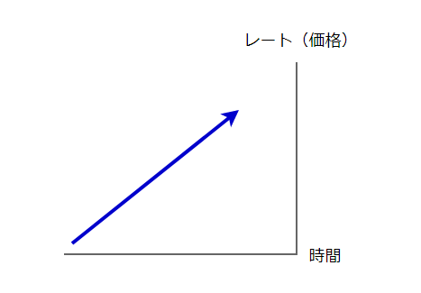
この状況は、多くのトレーダーがその通貨ペアを買い続けていて、売るトレーダーが少ないことを示しています。
その後、こうなりました。
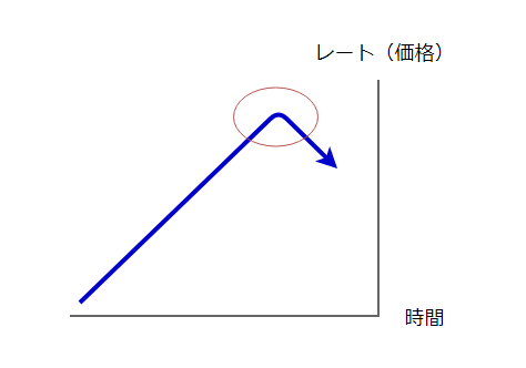
赤丸のところでレートは反転しました。なぜ赤丸で反転してきたのでしょう?
それは、赤丸よりも上のレートで買うトレーダーのパワーが、そこで売るトレーダーのパワーよりも弱くなったからだと考えられます。
つまり「赤丸では売りを仕掛けるトレーダーがたくさんいた(多くの資金で売られた)」ということを示しているわけです。
これを、違った図にしてみましょう。
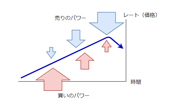
赤い矢印が「買いのパワー」で、「買いたい!」というトレーダーたちの力(資金力)を表しています。
青い矢印が「売りのパワー」で、「売りたい!」というトレーダーたちの力(資金力)を表しています。
レートが反転した場所というのは、「売りたい!」パワーが、ついに「買いたい!」パワーを上回ったポイントなのです。
言い方を変えると、そのポイントでは買いと売りの激しい攻防があったということであり、その戦いの結果、反転していったわけです。
反転したレートより上には、さらに大勢の「売りたいトレーダーたち」が待ち構えている可能性がある、ということにもなります。
そして、その反転したレートの上には、反転した場所から売ったトレーダーたちの損切り注文が、ズラリと並んでいる状況になっているのです。
再び「反転したレート」に到達したら?
だとするなら、もし「反転したレート」に再び到達したら、どういうことになるでしょう?
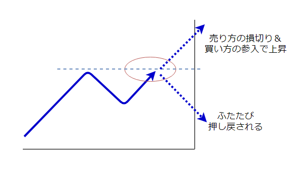
前回反転したレートでは、そこで待ち構えていた売りトレーダーたちも加わり、再び売りと買いの激しい攻防が起こります。
その後レートが上がっていくのか、それとも再度押し戻されて下がっていくのか、それは誰にも分かりません。
しかし、その「反転したレート」が大勢の相場参加者たちに注目されていることは間違いありません。
なぜなら、そこは多くのトレーダーが次のように考えるポイントだからです。
- 「そのレートより上では、買いたいトレーダーがいないかもしれない。だから、また反転して下がるのではないか?」
- 「そのレートを上抜ければ、そのレートより下で売っているトレーダーたちが損切りになる(=買い注文が増える)から、一気にレートが上昇していくのではないか?」
- 「前回反転したレートで自分も売りポジションを持ちたかった(乗り遅れた)ので、そのレートに戻ってきたら是非、売りエントリーをしたい」
- 「今、買いポジションを持っているが、そのレートよりも上昇しなさそうなので、そのレートに近付いたら決済(売り)をしたい」
- 「一度は反転して下落したが、さほど下がっていないので、売りたいトレーダーは少ないのではないか?(上抜けるのでは?)」
いずれにせよ、そのレートで何かしらの動きが発生する可能性があり、そのため多くのトレーダーの注目が集まっているということです。
では「反転したレート」がそれほど注目される場所だというなら、そこに目印をつけておくのが一番ですよね?
そう、それが「水平線(ライン)」なのです。
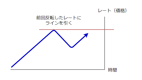
この図だけを見れば、ただ高値に水平線を引いただけに見えるかもしれません。
しかし、ここまで説明してきた内容を理解することで、テクニカル分析の基本である「高値と安値に水平線を引くこと」の重要性が、より実感できるはずです。
そして、ここまでの内容を踏まえることで、もうひとつ、とても大切な水平線を引くことがで出来るようになります。
さて、それはどんな水平線でしょうか? 前回のダウ理論の記事を理解していれば想像がつくはずです。
ここまでを少しまとめましょう
先へ進む前に、ここまでを少しまとめておきましょう。
反転したレート(高値と安値)が注目される理由
- レートが反転したポイントは、売りと買いが激しく戦ったポイントであり、一度は「反転させようとする側」が勝ったことを示している。
- そのレートに再び近づくと、また激しく「反転させよう」としてくる。
- もし反転できずに抜けたなら、「反転させたい側」の損切りと「突破したい側」の新規エントリーの方向が一致することによって、大きく動く可能性がある。
- そのため「反転したレート」は、多くのFXトレーダーに注目される。
これが、テクニカル分析において私たちが「高値と安値」に注目する理由です。
そこに水平線(ライン)を引くことによって、「何かが起きるかも!」という可能性を把握することが出来るようになるわけです。
FXトレーダーが注目する「もうひとつの水平線」とは?
「反転したレート」──つまり「高値と安値」が注目される理由が分かったところで、続いて、「高値と安値」のなかでも、特に重要な意味をもつレートについて解説していきます。
前回の記事ではトレンドの定義についてお伝えしました。
それは次のようなものでした。
トレンドの定義
- 高値と安値が切り上がっていれば上昇トレンド。
- 高値と安値が切り下がっていれば下降トレンド。
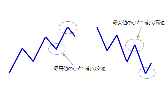
ですから上昇トレンドの場合、「最高値のひとつ前の安値」をレートが下抜けるかどうかは、トレンドの方向感がなくなる注目ポイント──つまり、トレーダーたちが「あれ?上昇トレンドが終わった?」と、不安になり始めるポイントだということです。
ということは、その「最高値のひとつ前の安値」──つまり「押し安値」を下抜けるかどうかが、とても注目されるということになります。
ですから、この「押し安値」と「戻り高値」に引く水平線こそが、とても大切なもうひとつの水平線(ライン)なのです。
高値と安値を見て、チャートがトレンドの定義に当てはまっていたなら、押し安値と戻り高値にも、しっかりと水平線を引きましょう。
どの時間軸のチャートに水平線を引くのか?
テクニカル分析で引く水平線は、ここまで見てきたように「高値と安値」「押し安値と戻り高値」です。
さて実際にチャートに水平線を引く場合、ひとつ問題が出てきます。
それは、「どの時間軸のチャートに水平線を引くのか」というものです。
1分足、5分足、それに15分足、1時間足、さらには4時間足──と、あらゆる時間足チャートに高値と安値はあります。そのすべてに水平線を引いていたら、チャートは水平線で埋めつくされてしまいます。
では、どの時間軸のチャートに水平線を引けばいいのでしょうか?
大きな時間軸ほど、たくさんの戦いの情報が詰まっている
ここで少し、ローソク足のおさらいをしましょう。
1時間足チャートに表示されている「1本のローソク足」は、どれだけの時間で確定(完成)するでしょう?
答えは──「1時間」です。
1時間足チャートのローソク足は、1時間に1本ずつ増えていきます。同じように5分足チャートでは、5分で1本のローソク足が出来上がります。
つまり、1本のローソク足の中には、その時間に起こった「売りと買いの攻防」──つまり売買の情報が詰まっているということなのです。
1時間足なら、世界中のFXトレーダーたちの1時間分の売買結果が「1本のローソク足」に詰まっているのです。そうやって出来たローソク足が連なって、チャートに高値と安値が出来ていきます。
例えば日足チャートにあらわれた高値と安値は、「24時間におよぶ戦いの情報」が詰まったローソク足が、さらに何本も何本も連なって出来たものです。
つまり日足チャートの高値と安値は、とても多くのFXトレーダーたちが長期間戦いに参加して、ようやく出来るものなのです。
ですから、日足の高値と安値が大勢のFXトレーダーたちに注目されていることは、火を見るより明らかですし、反対に5分足チャートにできた高値や安値の注目度は、ずっと低いということも分かります。
FXでは大きな時間足チャートを優先して水平線を引く
テクニカル分析において「どの時間軸のチャートに水平線を引けばいいのか」の答えは、「大きな時間軸から優先して引く」ということになります。
具体的にはデイトレードの場合、日足と4時間足、さらには1時間足に引くのが基本になります。スイングトレードなら、週足にも水平線を引いておきます。
そしてこれらの水平線を判断材料にして、「どうトレードしていくか?」というトレード戦略を立てていきます。
FXのデイトレードの場合、日足~1時間足に水平線を引くこととあわせて、その日のトレードの初めに週足チャートをチェックして、「週足の高値と安値に近づいていないか」を確認することをおすすめします。
週足チャートの高値と安値に差し掛かることは、なかなかないことです。
しかし、だからこそ週足の高安値に差し掛かっている状況は、多くのFXトレーダーが注目するものであり、大きな動き(波乱や混乱)が生じる可能性があるということでもあるのです。
どのタイミングで水平線を引く&消すのか?
レートの動きの中で注目すべきポイントは「反転したところ」でした。
理由は、そのポイントでは過去に「これ以上はいかせないぞ! 反転させてやる!」という反対勢力が現れて売り買いの激しい攻防になり、一旦は反転に成功した場所だからです。
その戦いの痕跡が「高音と安値」になって、チャートに表れているのです。
もしも、またそのポイントにレートが到達すると、再度戦いとなって何かしらの値動きが生じる可能性があります。
だから、そこに水平線を引いて注目しておくのです。
ということで、水平線を引く場所は「高値と安値」、そして「押し安値と戻り高値」だということが分かってもらえたと思います。
そうなって来ると次に問題になってくるのは、「どのタイミングで水平線を引いたり、消したりするのか?」ということになります。
そこでここからは、水平線を引く&消す基本的なタイミングについて解説していきます。
レートの動きに沿ってチャートに水平線(ライン)を引く
それでは、実際の流れに沿って水平線(ライン)を引いてみましょう。
下の図では、すでに上昇トレンドになっているものとします。
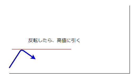
まずチャートを見て、「誰が見ても反転した」と思える高値に水平線を引きます。
今はまだ、自分なりの自信をもってラインを引くことが難しいと感じるかもしれませんが、これも段々と慣れていきますので、まずは練習あるのみです。
コツは「誰が見ても」というところに水平線を引くことです。
「あなた」がどう思うかよりも、「他のFXトレーダーたち」がどう思うか、それを想像してみることが大切です。
では、先へ進みましょう。

さて、先ほど引いた水平線(ライン)をレートが上に抜けてきました。
高値を更新して(高値が切り上がって)上昇トレンドが継続している状況です。
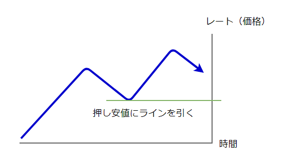
そこで「ひとつ前の最安値」──つまり「押し安値」に水平線を引きます。
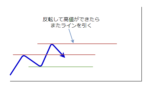
再びレートが明確に反転して高値をつけましたので、その高値に水平線を引きます。
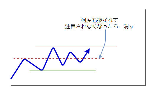
上の図では、反転してきたレートは、最初に引いた水平線を何度も上下に抜いてしまっています。
こうなってくると、その水平線は「みんなに注目されなくなった可能性がある」ということなので、消すことにします。
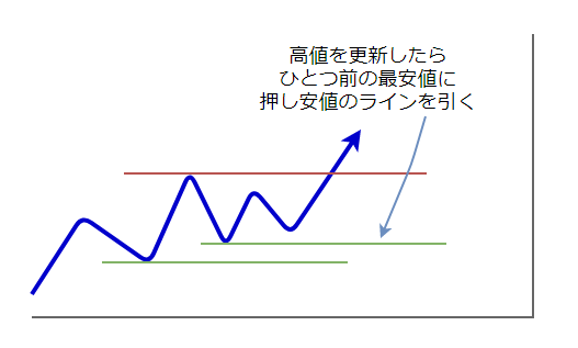
その後、また高値を更新しました(再び高値の切り上げ)。
ですので前回の高値との間の最安値に、押し安値の水平線を引きます。
──この様にして、水平線(ライン)を引いたり消したりしていきます。
基本的にはこのように考えながら水平線を引いていくわけですが、実際には様々なケースがあり、判断に迷うことも多くなってきます。
しかし判断に迷うような状況というのは、「他のFXトレーダーたちも迷っている」ということでもあるので、「みんな迷っている」ということ自体が大切な情報になったりもします。
また、水平線によって「強い水平線」と「弱い水平線」というものもあり、こうした判断も含めて、トレード戦略を立てる上での大切な要素になってきます。
他にも、ダブルボトムやダブルトップのネックラインとなる水平線などは、一旦抜けたとしても将来的に再び意識されるケースもあります。
こういった詳細については、また別の記事で取り上げていきます。
大切なのは自分の手でチャートに水平線を引くこと

以上、テクニカル分析において重要な働きをする「水平線(ライン)」の説明と、その引き方についてお伝えしてきました。
ここまでの内容を知ることで、あなたもチャートに水平線を引けるようになっているはずです。
そして大切なのは、実際にあなたの手でチャートに水平線を引いてみることです。
それも、何度も何度も繰り返しやってみて下さい。
FXトレード上達のコツは、自分の手を動かして繰り返し練習してみることなのです。
難しく考えず、シンプルに自分で水平線を引いてみる
さすがに読んだだけで完璧に身につくようなものではありませんから、スポーツと同じように何度もボールを投げたり、バットを振ったり、というように繰り返すことが大切になってきます。
そうする中で「あれ? こういう場合は、どうすればいいんだろう……」と、あなたなりの疑問点が出てくるはずです。
例えば今回の内容でいえば、あなたは既に「レンジの中では、どうやって引けばいいんだ?」という疑問が出ているかもしれませんね?
実は、レンジの中でも基本は同じです。
「多くのFXトレーダーたちが注目していそうな高値と安値」──この基本に沿ってシンプルに考えれば大丈夫です。
以上、チャートに水平線を引く方法とその意味とは?ラインの引き方を徹底解説について、お伝えしました。
次回予告
今回の「水平線の意味とその引き方」に続いて、次回は「水平線(ライン)の役割」についてお伝えしていきます。
あなたが引いたその水平線は、状況によって「サポートライン」「レジスタンスライン」と呼ばれます。その意味と役割、使い方について、次の記事で詳しくお伝えしていきます。
それでは、下のリンクからご覧下さい。

こちらの記事もおすすめです